Python template for scientific 1D loglog, semi-log line plot
Many data tend to grow exponentially, e.g. population, stock price.
When you want to analyze a data or phenomenon that you don’t know what it is, you can often draw a logarithmic graph and see if it becomes a straight line. This is because physical phenomena are often expressed by equations like this
x=ae^kt
Taking the logarithm of this, we get
log x = kt + logA
So, if we graph t and log x, we get a straight line. This is useful because we can estimate k from the slope of the line and log A from the y-intercept, able to find trend in data without transformation.
The pros and cos for each type of plot is summarized below.
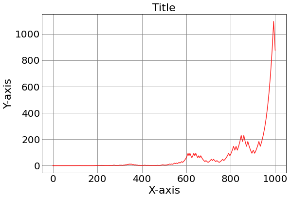
Normal scale plot
Advantages: You can intuitively see how many times each piece of data is different from the other, and how far it is from the other. Also, if the data on the vertical axis and the data on the horizontal axis can be approximated by a linear function, you can intuitively see the slope and intercept.
Disadvantage: When the data are many digits apart, the points are crowded near the origin, making it difficult to see.
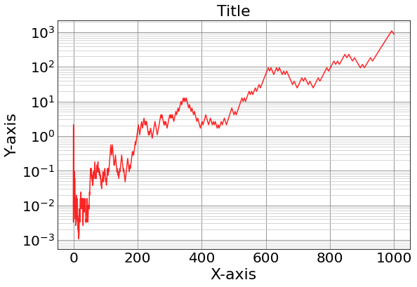
Semi-log plot
Advantage: If one of the two measurements can be expressed as an exponential function of the other, the relationship is expressed as a straight line and is easy to understand.
Disadvantage: Useless except in the case above.
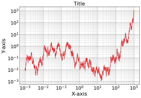
Log-log plot
Advantage: When the data y increases power with respect to y e.g. y=ax^n, the graph becomes a straight line with slope n. In other words, you can see at a glance the relationship between the measured values that are in a power relationship.
Disadvantage: Even if the difference between the two data is 100 times, the difference on the graph is only two scales, making it difficult to intuitively understand the difference. In other words, it may hide large difference in values between two plots that has small separation.
Below write python template code to generate 1D line plot by normal, semi-log, log-log scale.
import matplotlib.pyplot as plt
import pandas as pd
import numpy as np


#------------------------------------------------------------
#- Template function to generate scientific log-semilog plot

def custom1DPlot(x,y,type):

    fig, ax = plt.subplots( figsize=(9,6))
    plt.ticklabel_format(useOffset = False)
    if type == "Log":
        ax.loglog(x,y   ,'r-',  alpha = 0.85 );
    else:
        ax.plot(x,y   ,'r-',  alpha = 0.85 );
        if type == "SemiLog":
            ax.set_yscale('log');
    # Set the title etc.
    ax.set_title('Title', fontsize=22)
    ax.set_xlabel('X-axis',fontsize=22)
    ax.set_ylabel('Y-axis',fontsize=22)
    # Display Grid.
    ax.grid(True,linestyle='-',color='0.5', which = 'major')
    ax.grid(True,linestyle='-',color='0.8', which = 'minor')
    # Set boundary of plot.
    for label in ax.xaxis.get_ticklabels():label.set_fontsize(20)
    for label in ax.yaxis.get_ticklabels():label.set_fontsize(20)
    # Remove ticks
    ax.tick_params(which='major',length=0)
    ax.tick_params(which='minor',length=0)
    ax.set_axisbelow(True)


#------------------------------------------------------------
#- Test - crate stock price like data using random walk

np.random.seed(6)
N = 2000
X = np.logspace(-3, 3, N, endpoint=True)
Y = list();

Y.append(0.01)
for i in range(1, N):
	move = -1 if np.random.random() < 0.5 else 1
	next = Y[i-1]*1.25**move
	Y.append(next)


custom1DPlot(X,Y,"Normal")
custom1DPlot(X,Y,"SemiLog")
custom1DPlot(X,Y,"Log")
> Normal Scale Plot
> Semi-log Scale Plot
> Log-Log Scale Plot